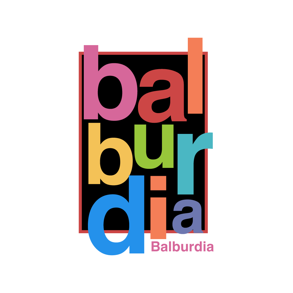
Word mark for a beer brand

0
Criados na 99designs por Vista
Wordmark designed for a beer brand representing chaos and disarray. I wanted to reflect the feeling of organized chaos using just the word mark. The colours used were provided from the client, which adds to the feeing of disruptiveness. I’ve also posted the piece in black and white showing the readability of the work in two tone.