
Criados na 99designs por Vista
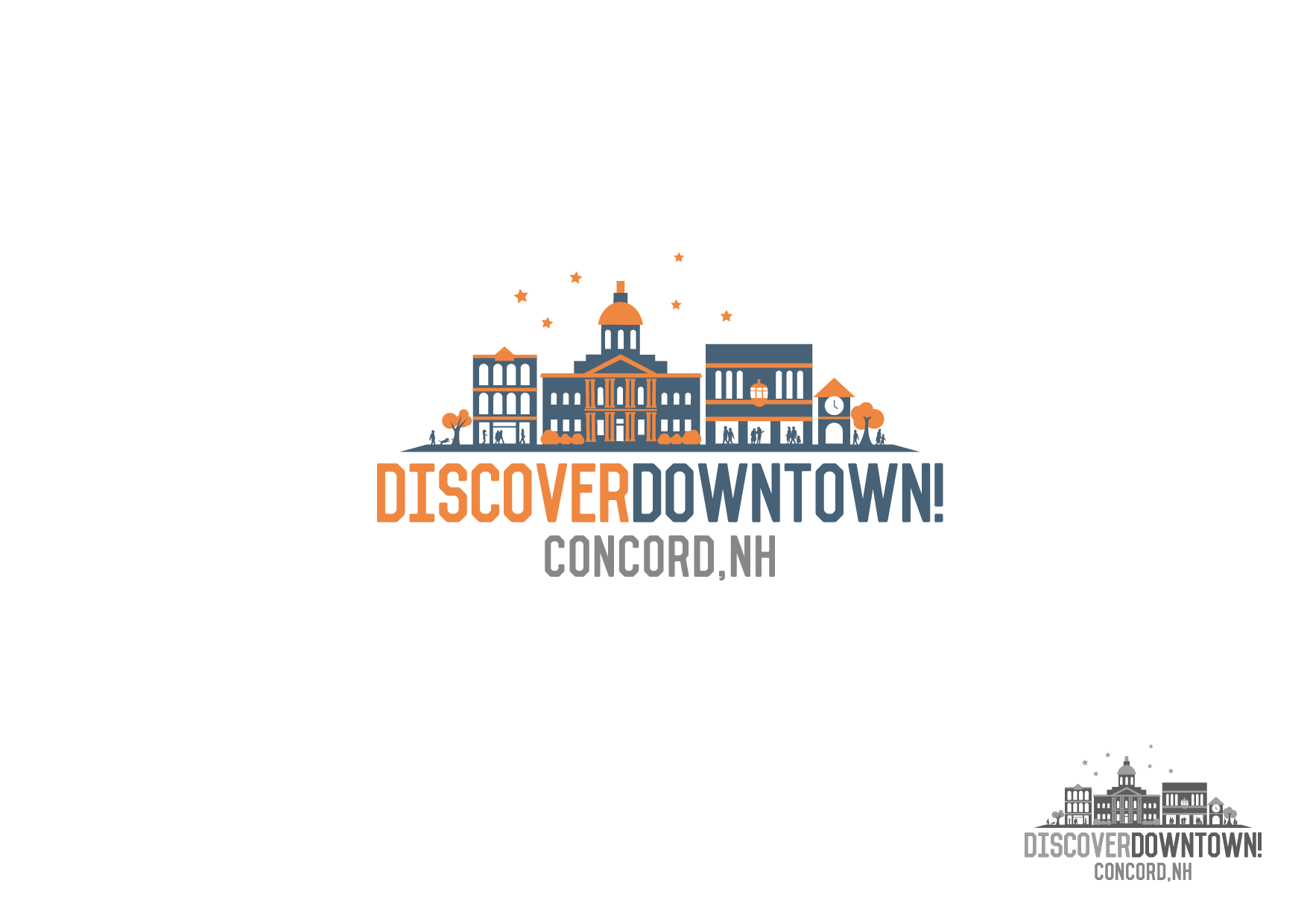
For this logo the initial idea was to create rounded silhouette buildings a second color was introduced to give a bit of details to resemble the buildings it represents in Downtown Concord to convey fun later this changed to a horizontal layout to give more space and add more buildings as what the Contest Holder wanted.