
Criados na 99designs por Vista
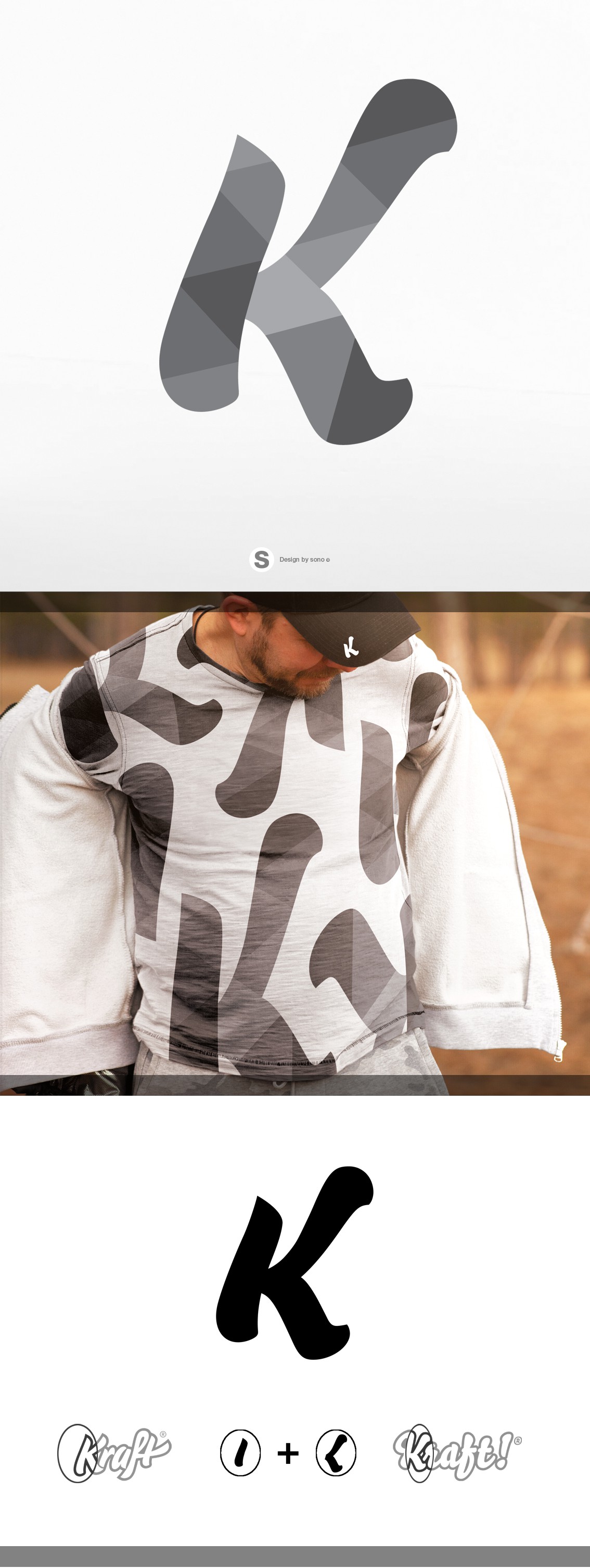
Based on the existing Café Kraft® and GimmeKraft!® logos, the new lettermark combines the LEFT portion of K from Café Kraft with the RIGHT portion of K from GimmeKraft!
The new K lettermark is recognisable as being affiliated with its parent brands in a simple, clear form, that is both decipherable and distinct.
The geometric patterning pays homage to its Franconian roots highlighting the aspects of the cliff face, environment and natural rock formations.