Logo for a high-end cannabis company

1
Criados na 99designs por Vista
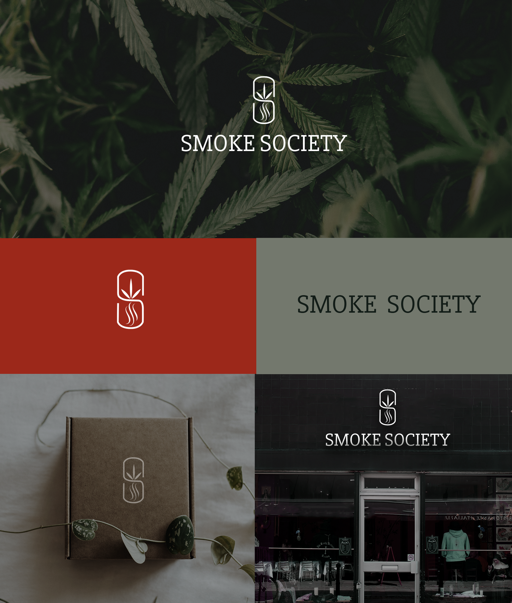
For the brand identity of smoke society, I developed a visual project that conveys a sophisticated brand for adults, with quality products. Uniting the concepts of the letter "s" that surrounds the cannabis plant and the smoke that at the same time the lines represent "society". A minimalist, versatile, easily recognizable logo that can be used both the icon alone and the text alone, so that it works on digital and print platforms. A logo that is undoubtedly memorable and unique. Perfect for the smoke society business