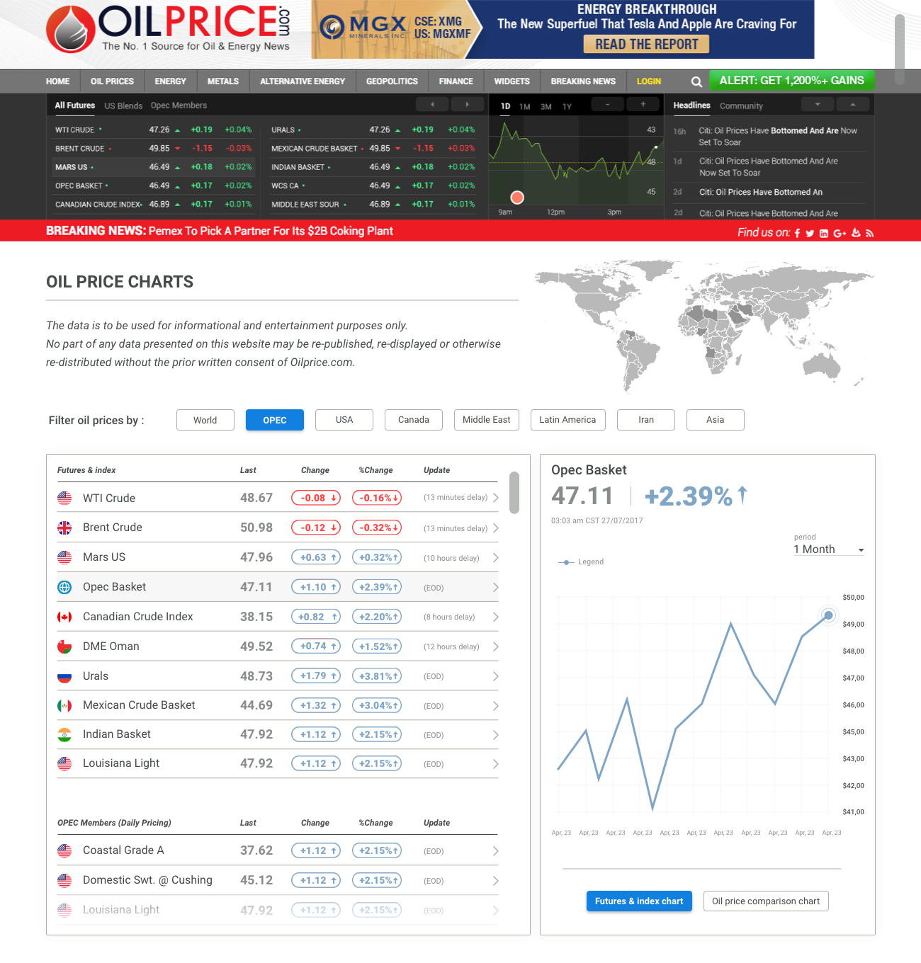

The customer wanted to review the index oil prices page of his site. I have worked on:
- Usability
- Readability
- Graphic restyling
Usability.
The original suffered from a defect that misaligned index selection and charts. So I’ve included all the elements in two fixed-height cards visible at most screen resolutions. As a result charts are shown using switch buttons.
Readability.
Due large amount of data I tried to reduce the visual stimuli.
I worked on typography (hierarchies, colors and highlights) and grid (12 columns) to calibrate spaces, I fixed a typographic scale and kept the characters as large as possible assuming senior users.
I proposed the world map (that could be interactive) to reduce full screen width of the introduction.
Graphic restyling
I choose a color palette that would work with one in use.
Blue has been preferred to green in use to avoid the sense of approval associated with this color code. I try to keep tints brilliant but sophisticated.