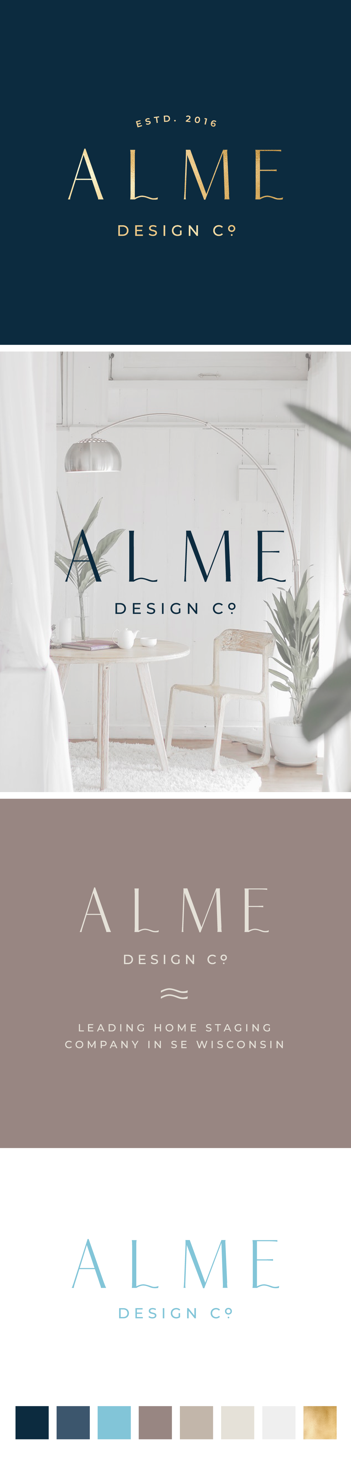
Branding concept for Alme Design Co, home staging business based in SE Wisconsin

1
Criados na 99designs por Vista
After looking up the businesses website and finding that they were located near the Great Lakes that border Wisconsin I decided to subtly allude to this within the logo design. I created some custom typography by altering the letter L and E and adding a wave shape to them to represent the water. The typography is completely unique and timeless and will grow with the company.