
Criados na 99designs por Vista
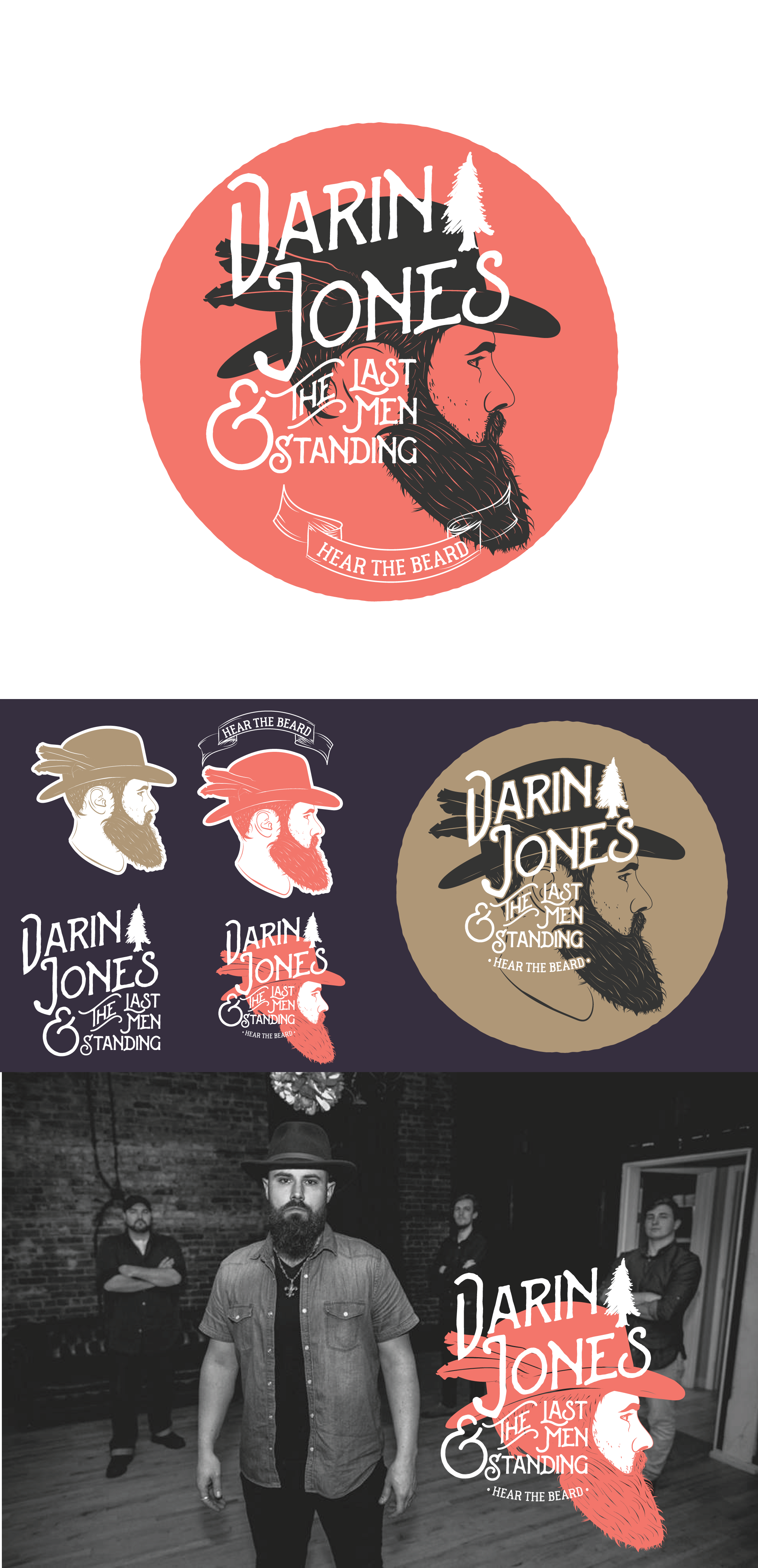
For this design, I went back to the original stacked wordmark design look as requested with the slanted catchword "the." I made the name "Darin Jones" the larger part of the wordmark and removed the swirls for the start letters. I went back to the vintage red character mark as well and added a gold version that looks amazing on black t-shirts (especially soft vintage/heather styles). I tried a few variations of the layout but kept all of the elements as separate branding items so you can mix and match based on the marketing and promotional area you have to use for your logo and brand design and any other needs.