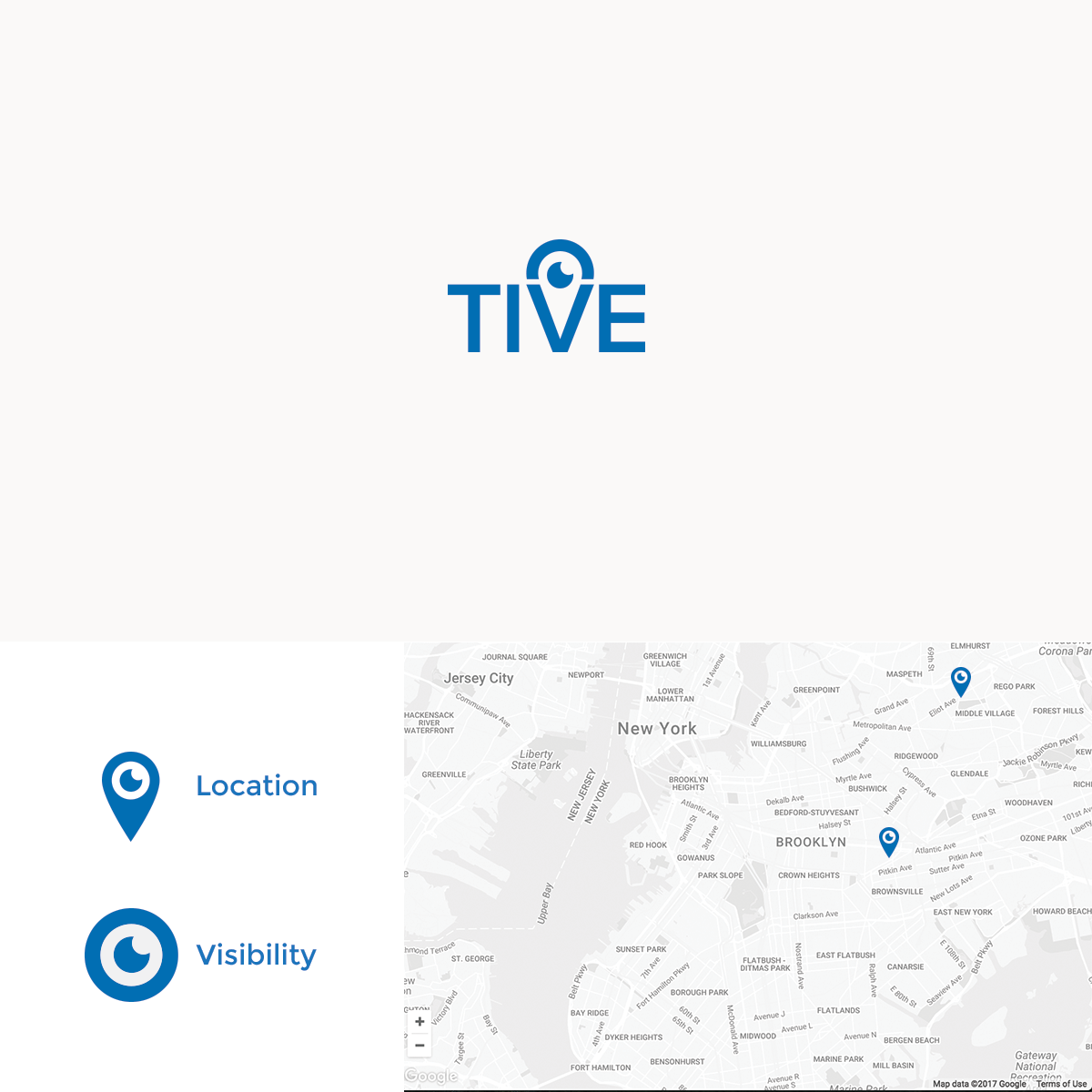

In Tive's branding brief, they brainstormed about a number of ideas regarding watching, being aware, and even the eye of Sauron... which I loved seeing!
This of course made me want to play with the idea of an eye to signify the watchful nature of what it is that Tive's company does.
They are aware, perceptive, and insightful into what is going on within their sight and their reach. An eye was a natural way to portray this idea.
But what was it that they are aware of? They're aware of WHERE everything is - the location. This provided to opportunity to use a location pin to create our very own "Eye of Sauron" within the wordmark.
This eye -- unlike Sauron's eye -- is approachable and trustworthy and can stand as it's own to be distinctly belonging to Tive.
I'm wasn't completely sure what their UI looked like, but I thought that the location pin also gave an opportunity to even continue the eye motif in more places than just the logo.