Humboldt Family Cannabis Farms

2
Criados na 99designs por Vista
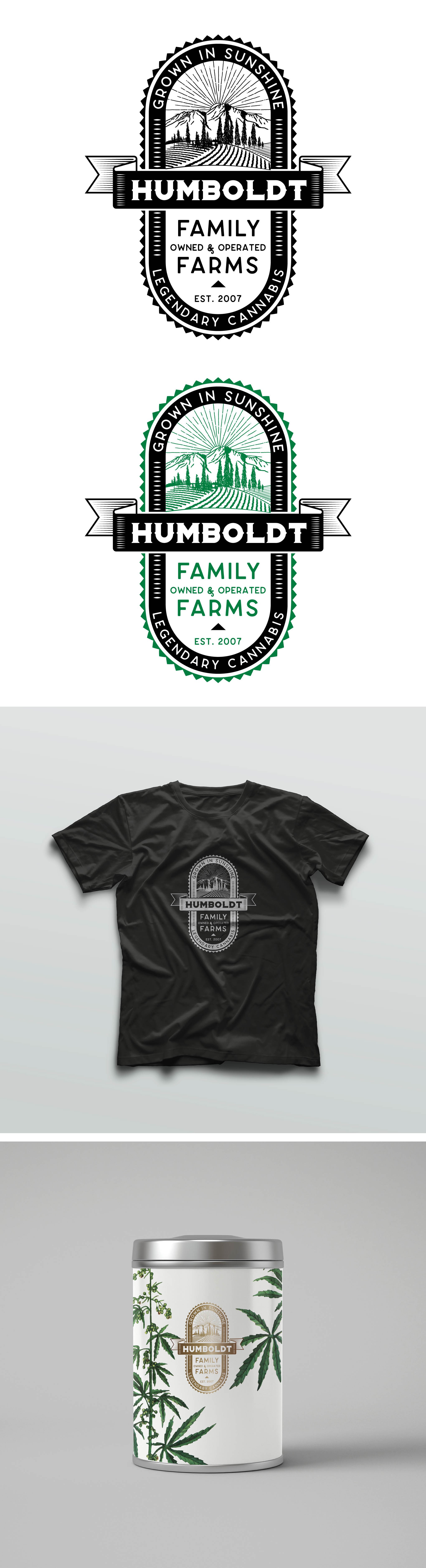
The client curates and distributes cannabis flower and organic CBD products from some of the best farmers and manufacturers in Humboldt County, CA, and beyond. They wanted a logo that contained classic and organic elements. Professional enough for a corporate logo but cool enough that people would want it on a t-shirt. They asked to stay away from the use of the marijuana leaf in the logo. "More John Deere than Grateful Dead.
"
• Craft
• Humble
• Natural
• Family Farm
• Sustainably Farmed
• Hard Working Farmers
• In The Field
• Grown In Sunlight, Outdoors
• More John Deere Than Grateful Dead
• More Farming than Hippy
• More Co-Op Than Corporate