Criados na 99designs por Vista
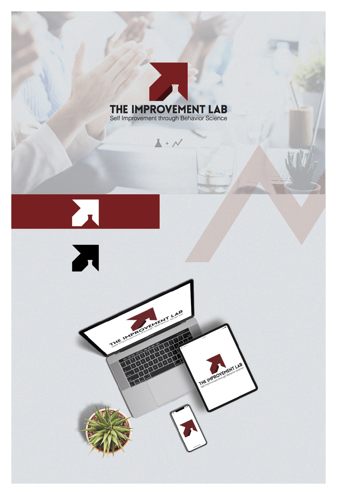
While reading the brief and the business name of this client's contest I knew that implementing a lab in the logo will be simple, but the "improvement" was giving me a hard time...how to make it work and make sense? The truth is idea came all of a sudden when my wife was telling me how she wanted to get a promotion at work and she pointed up...that's it, progress should be presented by pointing up towards success. Taking it from there, making an arrow pointing to the upper right like in stock exchange graphs and adding a lab flask in negative space on the bottom part as a foundation for the behavior science. I chose red color to bring the emotion of passion, energy, strength and desire to self improve.
